mingle
packaging / branding / illustration
Art Direction: Soonduk Krebs
School: Tyler School of Art and Architecture
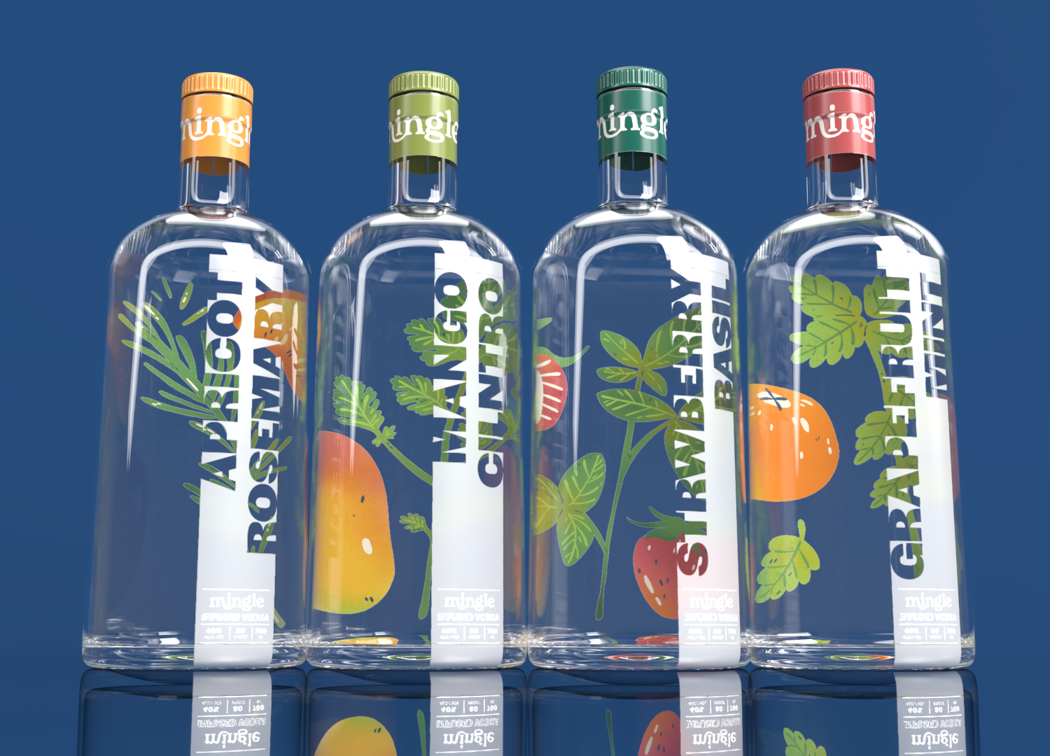
Mingle is a naturally flavored vodka brand tailored toward younger consumers looking to venture up from the bottom shelf. The four flavors are: Apricot-Rosemary, Mango-Cilantro, Strawberry-Basil, and Grapefruit-Mint. Each flavor inspires sophisticated taste pairings and cocktail experimentation. I was inspired by how clear vodka is during the design process and brought that inspiration through the project. The bottles are joined by a party pack filled with mini-bar bottles and a social media presence
the brand
The goal of the brand is to feel young, bright, and inviting. The type-based logo is simple with two letters connecting to depict the idea of mingling. The Mingle logo incorporating secondary type is designed for large-format use, while the logo without secondary type is used for all other applications.


Each flavor of vodka has a different colored label that I felt best represented how the fruit and herb tasted together. For example, apricot and rosemary are subtle but bright, while grapefruit mint is bold and acidic. The colors are bright but slightly muted to add maturity to the brand.
I wanted to keep the labels simple and allow the viewer’s attentions to be drawn through the bottle and to the illustrations on the back. The labels have a slight transparency, allowing the alcohol information at the bottom to come forward.


